
Dustin
User testing
Deep interviews
Card sort
5 second test
Archetypes
Empathy mapping
Accessibility
Design system
A/B testing
Agile development
Workshops
Design strategy
Dustin
User testing
Deep interviews
Card sort
5 second test
Archetypes
Empathy mapping
Accessibility
Design system
A/B testing
Agile development
Workshops
Design strategy
Dustin
User testing
Deep interviews
Card sort
5 second test
Archetypes
Empathy mapping
Accessibility
Design system
A/B testing
Agile development
Workshops
Design strategy
Role
UX/UI Designer
Time frame
2022
Platform
Web
Role
UX/UI Designer
Time frame
2022
Platform
Web
Role
UX/UI Designer
Time frame
2022
Platform
Web
01
Tending to a neglected start page
For an e-commerce site, the old start page was striking in that products were hard to find. In-depth user interviews revealed that the page failed to meet their needs. It was cluttered with oversized banners and felt more like an ad space than a storefront. Users wanted personalised content, including products, campaigns, and shortcuts to frequently used features. Based on these insights, I redesigned the start page to better meet user needs and create a welcoming, functional storefront for Dustin.

Old B2B start page with annotations, highlighting some of the main problems and pain points.
02
User testing the new prototype
Using insights from interviews and analytics, I created a hi-fi prototype designed to meet both user and business needs. Hypotheses like “personalisation will boost conversion” and “more products will increase relevance” guided further user testing. Usability tests employed the Think Aloud method with current users, complemented by a Card Sort in FigJam to rank start page elements from most to least important.

Screenshot of the card sort exercise during a user test with a B2B customer.
03
A start page designed after the users' needs
The final round of user testing confirmed some hypotheses and revealed new user needs. I used these insights to iterate the prototype one last time before handing it to developers. Key goals for the redesign included increasing clicks to product pages and average order value. B2B users wanted a personalised start page with tailored product recommendations, which led to integrating the AI-driven merchandising tool, Elevate. Based on this, the main enhancements I implemented were:
Personalised categories placed in the fold for quicker navigation.
Individualised product recommendations in a new compact product card.
Two new card designs of products and campaigns/news.
A banner carousel creating more ad slots without compromising monitor space.
Product carousels allowing to show more products but in a smaller area.
Information banners below the header for highlighting larger campaigns.
Before and after of the start page.
04
Creating archetypes to get rid of biases
Although previous designers had conducted substantial user testing, most findings were lost due to a lack of documentation. To align the design team around research, I created a shared research repository. However, sharing insights with stakeholders through this alone proved challenging, highlighting the need for a more direct way to communicate user needs internally. Reviewing existing personas, I noticed sexist biases, such as “Johan, CEO, living in a villa” and “Jessica, receptionist, living in an apartment.” To address this and present user profiles neutrally, I developed archetypes for both B2B and B2C users, focusing solely on their goals, needs, and motivations. Labeled “version 1,” these archetypes were designed as living documents to be continuously updated and expanded.

First archetypes created for Dustin's users, categorised into B2B and B2C. Details blurred because of confidentiality.
05
Understanding the B2C affair
Dustin’s focus on B2B meant no user research had been conducted for the B2C segment. With consumer revenue declining, I was tasked with understanding potential B2C customers’ needs and motivations. This included conducting in-depth interviews and establishing a process for recruiting B2C participants for user testing. The insights uncovered key areas affecting user satisfaction and resulted in actionable recommendations for relevant teams to improve the B2C site and drive revenue.
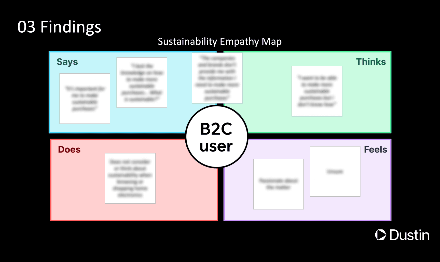
A slide from the B2C user test presentation held to stakeholders, revealing the findings related to sustainability through an empathy map. Details blurred because of confidentiality.
06
Fostering collaboration through the design system
Although the Dustin interface appeared clean and consistent, the underlying design system was outdated and disorganised. With designers and frontend developers working in silos, it was unclear which components existed or what their guidelines were. Establishing a clear, coherent, and user-friendly design system was essential to align UX and UI. I led this effort, collaborating closely with both design and frontend teams to update the system, create documentation, and establish guidelines that fostered a shared understanding across the company.

Example of component and guidelines in the design system. Details blurred because of confidentiality.
